The Box That Moved
Orchestrating chaos. A case study in the non-linear design process.
This isn’t a story about a flawless 4D process (Discover → Define → Design → Deliver). This is a story about what actually happens inside a designer’s head — a glorious, chaotic mess I’ve come to call the Design Tangle. It’s where logic, frustration, random images, and systemic thinking collide to (hopefully) create something brilliant.
This box arrived on the scene in a truly pathetic state. A heavy object, packaged in cheap cardboard that, during transit, morphed into something that looked chewed up by life itself. It dissolved with the ease of cotton candy, utterly murdering the joy of unboxing something even remotely valuable.
Monochrome low-density printing, a barcode sticker the size of a matchbox, a huge logo, simple cut-out handles that tore off mid-shipment, and evidence of an unboxing that had already begun without the customer’s consent — yeah, this thing was screaming for a full-blown redesign.
The Catalyst: A CEO’s Spine and a Designer’s Rage
The defining moment was a video call with Bing, the CEO, who tried to haul the box with a chair from his garage into the living room. It would have been hilarious if it weren’t so tragic. We’re talking 60+ pounds of pure office “heavyweight.”
A narrow doorway from the garage (a masterpiece of spatial planning) into the living room. Arms stretched wide, his back bidding a firm “goodbye,” his spine checking out somewhere behind him with an audible crunch… “Please let that be my iPhone,” Bing thought.
After trying every possible angle to shimmy this behemoth through, Bing was on the verge of giving up. He attempted to kick-shove it across the floor, but the door threshold was having none of it. The first handle had already been torn off ‘with extreme prejudice’ during delivery. Finally, after ripping off the second one, Bing forced the box into the room.
The chair suddenly seemed less ergonomic, and his spine was creaking a protest with all 33 vertebrae. And we were tasked with fixing this hot mess.

The Tangle Begins: A Logical Deconstruction
The best insights are often hidden in the most awkward, painful moments (you’re a hero, Bing). They force you to solve for the real, physical world, not just a pristine brief. This wasn’t chaos; it was the start of a logical deconstruction of a broken system.
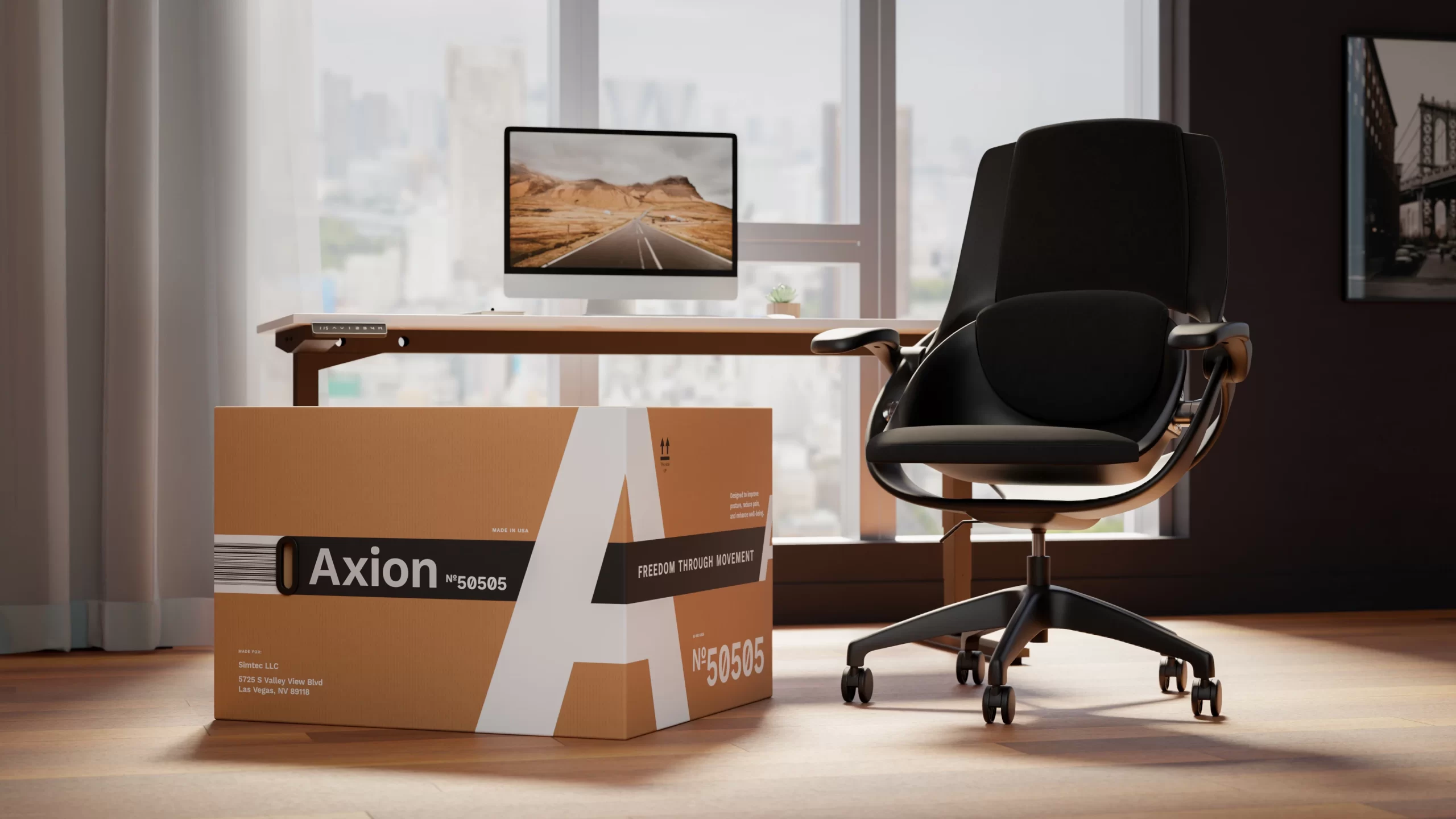
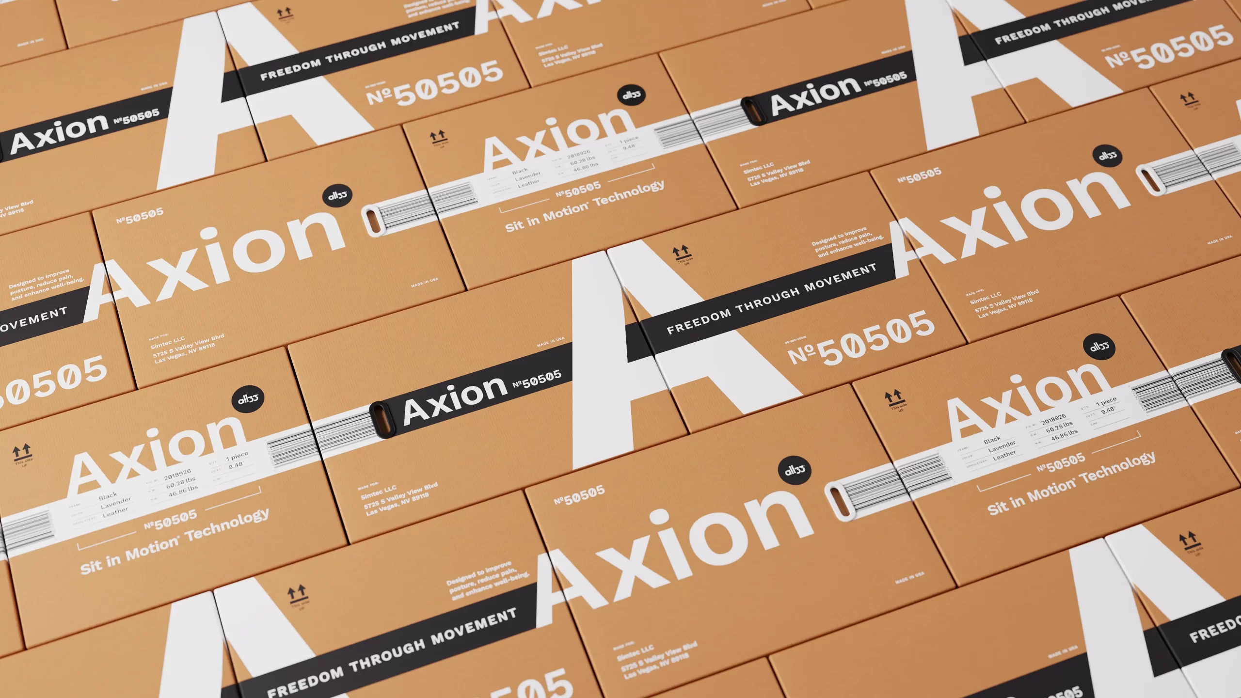
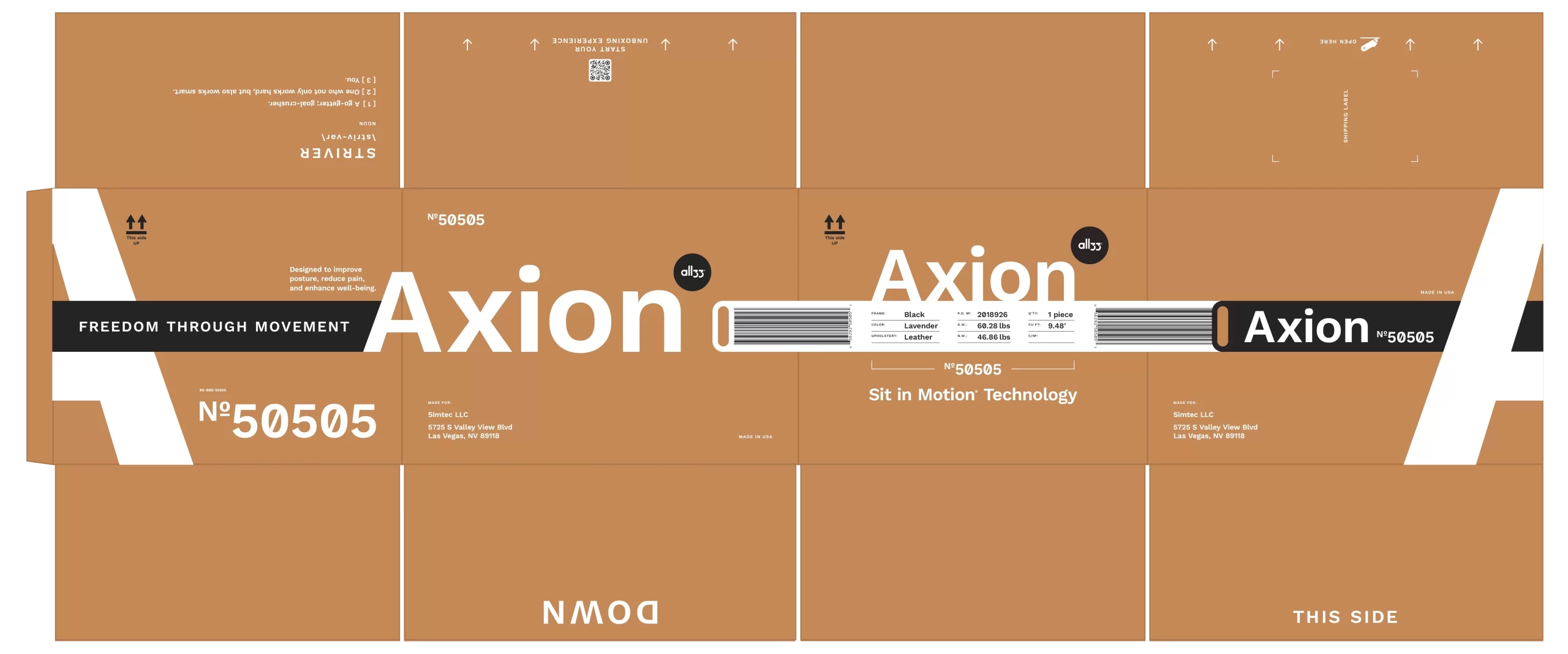
I started with the fundamental physics: orientation. I’m a Principal Designer; I can change the rules. Turning the box on its side transformed it into a suitcase—a familiar, narrow object. But a suitcase has handles. Ours didn’t. Bingo.
That’s when the pivot happened: placing them on adjacent panels, reorienting the entire ergonomics of carrying. Heavy-duty plastic handles, of course. We didn’t want to tear the box’s delicate flesh. Or our hands.
The Domino Effect: From Handles to the Warehouse Matrix
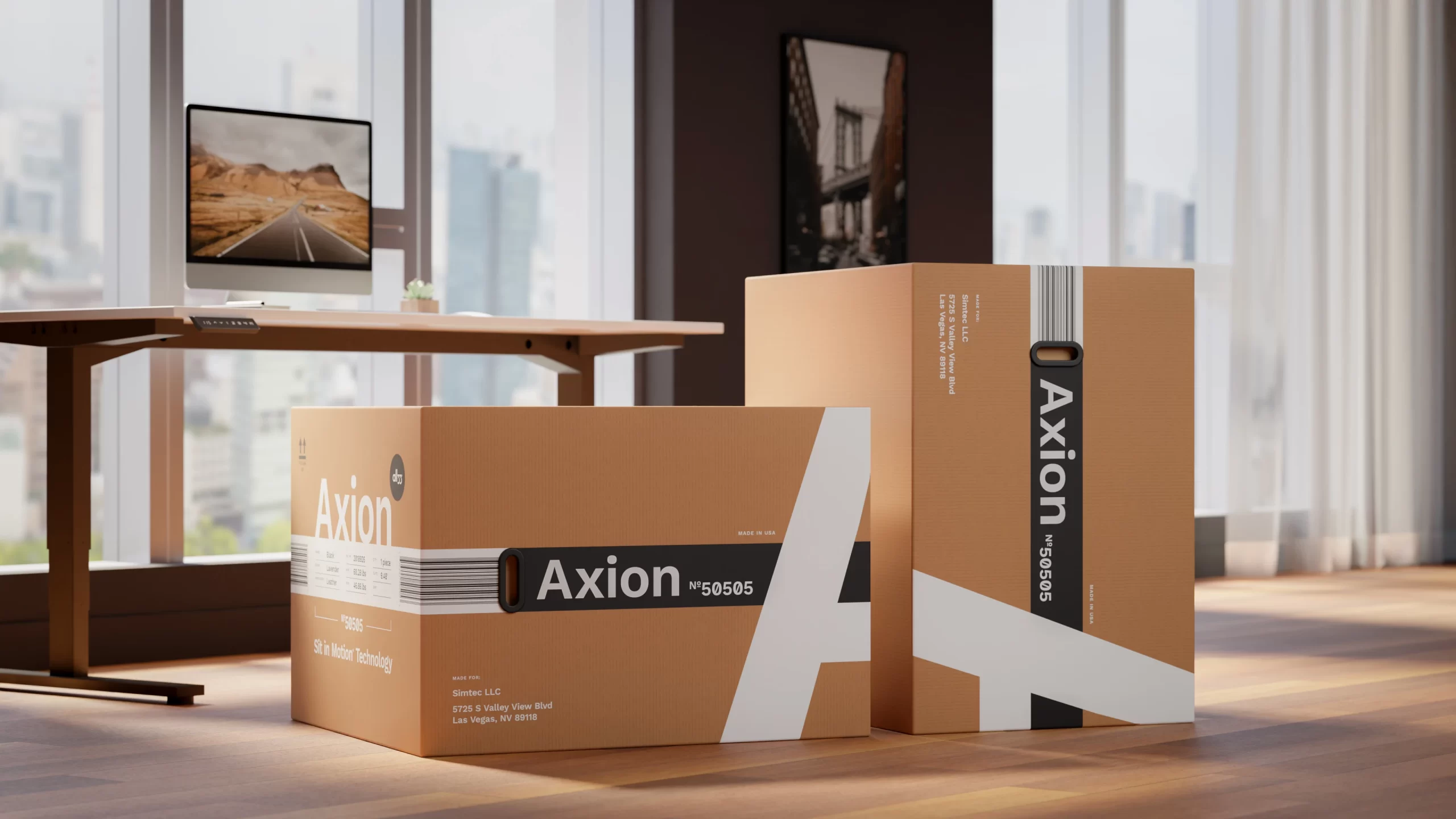
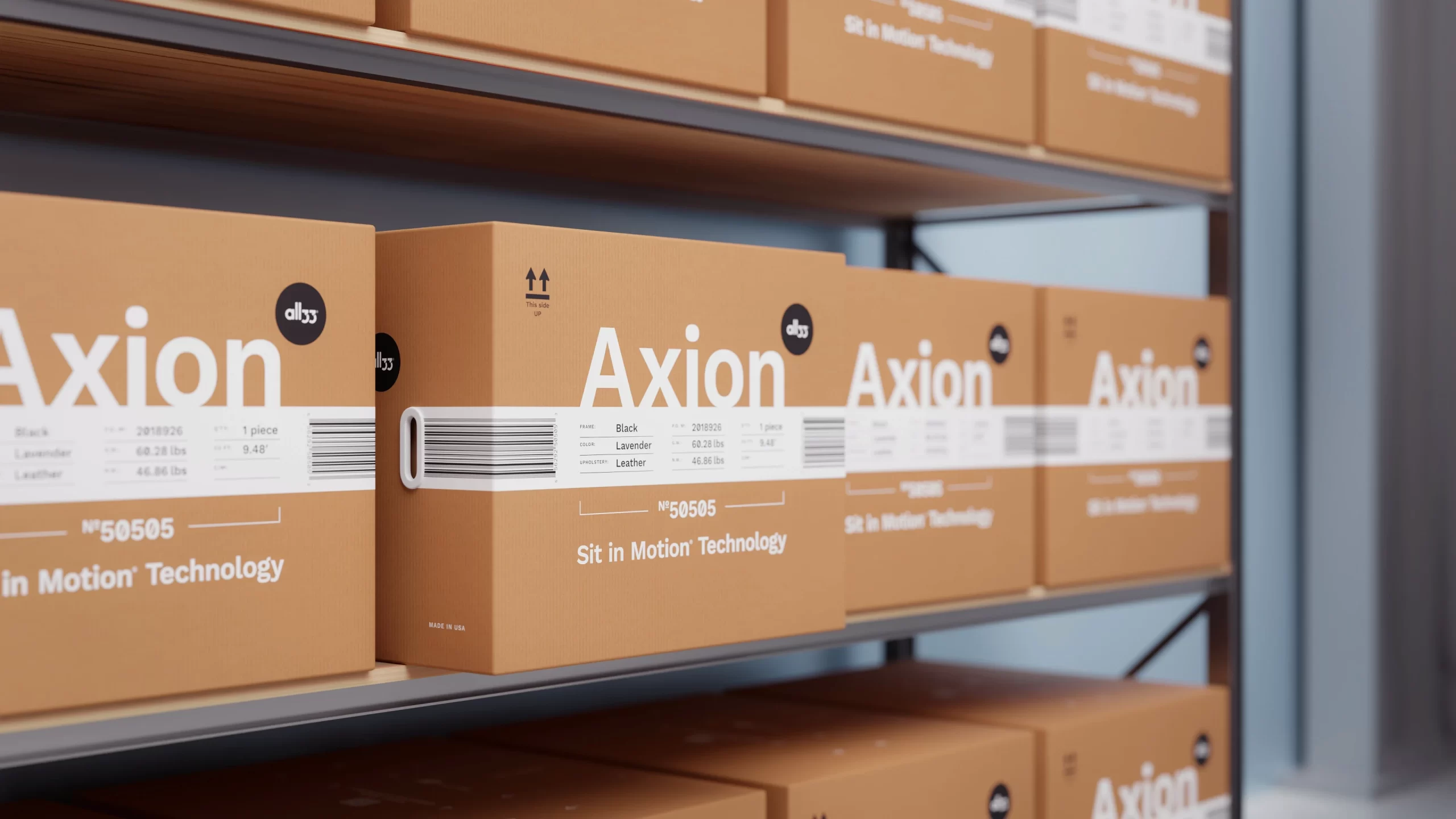
Visualizing the sheer agony of warehouse workers rotating this heavy box in search of information, I started with the barcode—it was practically begging to be on all sides. I limited myself to three out of six sides. But I wasn’t stingy either—I generously stretched it across the planes, right between the new handles. If it gets damaged on its journey, its size increases the chance it can still be scanned. One less problem to worry about.
The Architectural ‘A‘: From Container to Billboard
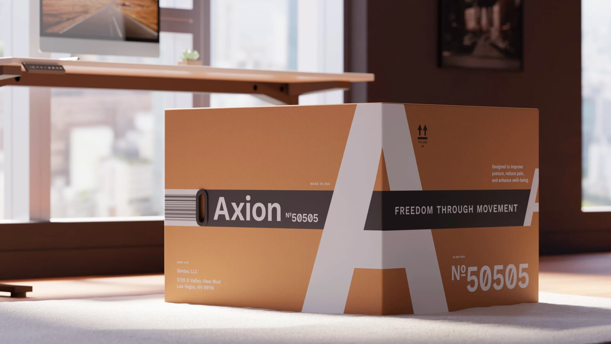
On to the main design. The cardboard would be a hefty 5-ply corrugated kraft, in a gorgeous, earthy warm tone. Two ink colors: high-density, fully opaque white and black.
But with this box, I didn’t just have a lot of space—I had A LOT of space. Faced with such a vast canvas, a small logo would have been a whisper. This box needed to speak with confidence.
The giant ‘A’ wasn’t just filling space; it was creating an iconic, architectural statement. It became the central spine that connected every other element into a single, cohesive visual system. It transformed the box from a generic container into a bold brand asset, ensuring instant recognition from the warehouse aisle to the customer’s doorstep. Of course, the beauty of white on kraft was a happy, and very intentional, bonus.
I found a spot for the model info, upholstery type, color, SKU, and weight (a number we had, ahem, indirectly “felt”)—right between the handles, interrupting the barcode, I placed a data table. Why there?
Imagine this: the box is sitting on a warehouse shelf. A worker finds the right model, grabs it by the handles—those strangely oriented, but-this-time-actually-comfortable handles! Whoosh—a mental picture of a box sliding neatly off a shelf.
The warehouse worker is happy, the cashier is happy, the customer is happy — a ready-made picture for an ad intro for an awesome box ergonomic chair.
The Honest “Why”
The rest of the information found its place quite naturally. A marketer might say the wrap-around design “embodies the chair’s pivot function.“ And you know what? They’re not wrong. But the designer’s truth is even better: it created a visual rhythm that made the massive box feel cohesive and dynamic. It looked undeniably cool, it subtly reinforced the product’s core feature, and yes—it makes for a killer portfolio screenshot. A win-win-win, backed by intentional design.
Our copywriter, Manuela, blessed me with some witty unboxing prompts, and I placed those with ease. Finding a spot for the shipping label was a no-brainer, so I called the exterior done. The insides were anthracite black—dramatic, contrasting, mysterious. Especially since we had already reduced the total cost of the box by 58% and could now afford 2+1 printing.
The Guts & The Glory
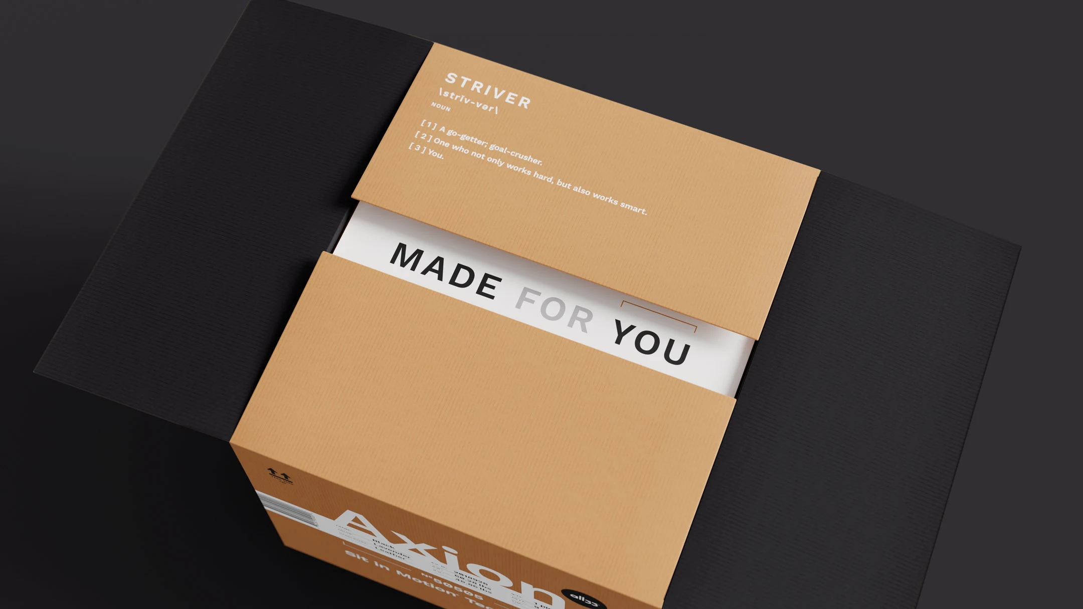
The original box’s interior was… non-existent. The chair parts were just thrown in “as is.” The factory came up with a triangular package for the small parts, which also reinforced the box’s corners and geometry.
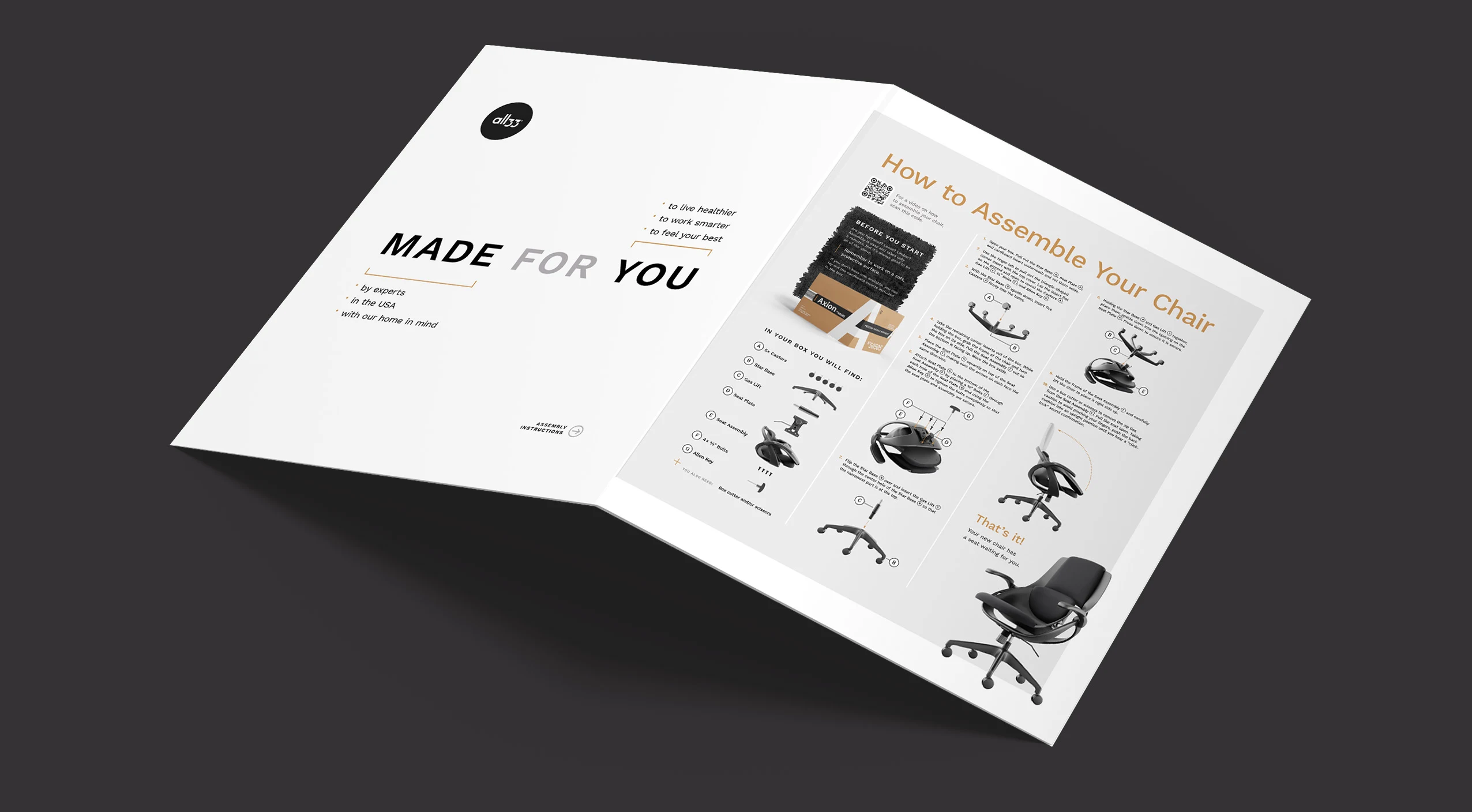
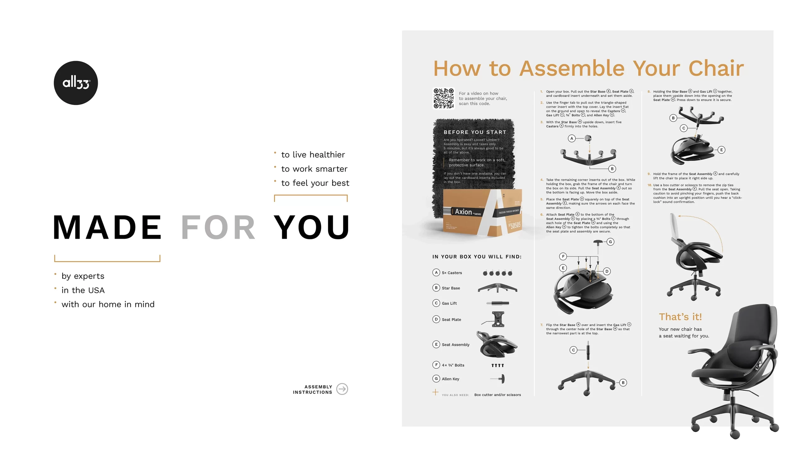
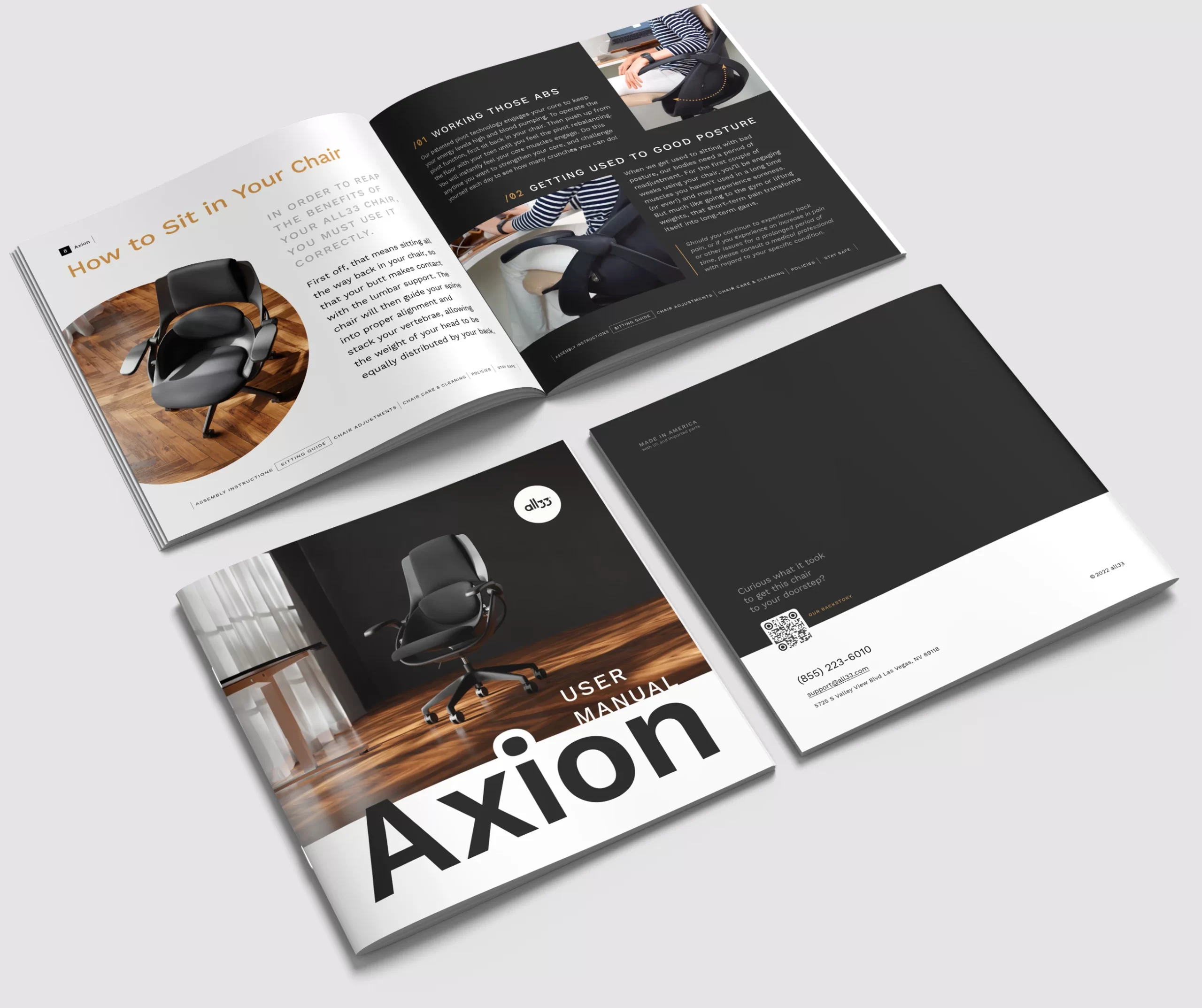
To fill the interior with something delightful, I created an assembly guide insert—a giant sheet of cardboard. Let me say it again: the sheer size was a dream. Large 3D renders for each step (thanks, Pavel!), QR codes linking to assembly videos—everything was clear and easy to read. The User Manual slipped into a parchment envelope and settled into the luxurious depths of the new packaging.
The box was ready. It was created with ergonomics in mind to fit the chair’s mission completely, resulting in a holistic experience. And no CEOs were harmed in the making of this design.
The Takeaway: The Adaptive Process
The “Design Tangle“ is not a messy mind, but a flexible methodology for tackling complex, multi-faceted problems. Our job as system designers isn’t to deny the chaos of the real world, but to design resilient, intelligent systems that not only survive it but make people’s lives a tiny bit simpler. Even if that means stretching a barcode across three sides and plopping a giant ‘A’ right in the middle of it all.
The box, finally, was designed to move. Just like our thoughts.
Afterword: The Autopsy
I originally wrote this piece several years ago, filled with the passion of solving a complex design challenge for a company called all33 and their Axion chair. I still believe in the “Design Tangle” process described above — it represents the kind of deep, human-centered problem-solving I live for as a designer.
However, the full story didn’t end here. Some months after this project, all33 filed for bankruptcy, leaving many customers who had pre-ordered the chair out of pocket and frustrated. The business, ultimately, did not succeed.
This context is crucial. It creates a difficult but important tension: can a design be successful if the product or company fails? I’m sharing this now not as a simple success story, but as a reflection on that very question. It’s a reminder that our work as designers exists within a larger business ecosystem. We can pour our hearts into creating a flawless user experience, but we don’t control the financial health, leadership decisions, or supply chain integrity of the companies we work with.
So, read this as a case study in functional and beautiful packaging design. But also read it as a cautionary tale about the separation between a great design process and a successful business outcome.
The box was designed to move.
The business, unfortunately, could not.
— Anastasia